“`html
How to Use Color Psychology in Decorating
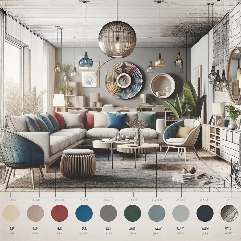
Colors have a profound impact on our emotions, decisions, and overall well-being. In home design, choosing the right colors can transform a space, making it feel cozy, vibrant, or serene. This blog post delves into the world of color psychology in home decor, exploring how each shade from red to black influences mood and environment. Discover how to strategically apply colors in your home to foster specific atmospheres, and ultimately, create a living space that rejuvenates your mind and spirit. Whether you’re matching a bold red with more subtle hues or relying on softer shades like blue and green, this guide empowers you to make informed, beautiful design choices.
Red
Red is a color full of energy and passion. Often associated with love and excitement, it can stimulate the senses, making it an ideal choice for lively spaces. By incorporating red into a living room or dining area, you encourage social interaction and conversation, creating a vibrant and exciting atmosphere. However, be mindful of its intensity; incorporating red in excess might lead to overstimulation.
To balance the vibrancy of red, consider using it as an accent rather than the dominant color. Features such as a red statement sofa, artwork, or accessories can inject energy without overwhelming the space. Pairing red with neutral colors like white or gray can enhance its visual impact, providing a harmonious and sophisticated setting.
Orange
Orange combines the energy of red and the cheerfulness of yellow, resulting in a warm and welcoming color. It is known to evoke feelings of enthusiasm and creativity, making it an excellent choice for social areas like kitchens and living rooms. Orange’s friendly appearance makes it ideal for creating inviting spaces where guests feel at ease.
Despite its warmth, orange can sometimes be overpowering, especially in small spaces. To avoid overwhelming the senses, use muted or pastel variations of orange, such as apricot or peach. These shades maintain the welcoming nature of orange while ensuring a balanced and comfortable environment.
Yellow
Yellow exudes happiness, warmth, and positivity. This cheerful color is perfect for spaces that benefit from an uplifting ambiance, such as kitchens, bathrooms, or playrooms. Yellow is known to stimulate mental activity and boost moods, making it an invigorating choice for environments where focus and positivity are desired.
To maximize yellow’s positive effects, use it in moderation and complement it with calming or neutral tones. Soft yellows paired with gray or white can create a sunny yet soothing environment, whereas bold yellows might be more suited for accent walls or decorative items.
Green
Green is synonymous with nature, providing a refreshing and calming presence that can make a space feel balanced and restored. Its soothing qualities make it a suitable choice for bedrooms and bathrooms, where relaxation is paramount. Green also embodies renewal and growth, making it perfect for spaces where creativity flourishes.
Earthy tones such as olive or sage can create a serene atmosphere, while brighter teals and emeralds add a touch of elegance and liveliness. Consider combining green with natural elements like wood or stone to enhance its organic appeal.
Blue
Blue is one of the most calming colors, often associated with tranquility and serenity. It is frequently used in bedrooms and bathrooms to create a peaceful retreat from the outside world. Blue’s ability to lower heart rates and reduce stress makes it ideal for areas dedicated to relaxation.
From soft sky blue to rich navy, the different shades available can help achieve various moods. Pairing blue with complementary colors such as white or beige furthers its soothing impact and keeps the space feeling airy and light.
Purple
Purple is the color of luxury, creativity, and mystery. Deep shades like royal purple can add a touch of sophistication and opulence to dining or living rooms, while lighter lavenders create a calming and ethereal space, suitable for bedrooms or spiritual retreats.
Purple’s association with spirituality and introspection makes it a powerful color for meditation spaces. To avoid overwhelming the senses, balance bold purples with lighter, neutral hues and incorporate textured fabrics to add depth and dimension.
Pink
Pink is often associated with romance, nurturing, and tranquility. While historically seen as a feminine color, pink has grown versatile, offering a range of shades from soft pastels to vibrant fuchsias that can add warmth and comfort to any room.
Light pinks work wonderfully in bedrooms or nurseries to create a calming environment, while brighter shades can be used as accents to energize a space. When used thoughtfully, pink brings a soothing and elegant charm, harmonizing well with both neutral and bold hues.
White
White symbolizes purity, innocence, and new beginnings, providing a blank canvas that can make spaces appear larger and brighter. In interior design, white is celebrated for its ability to create clean, modern, and minimalist aesthetics.
Ideal for any room, white reflects light, enhancing airy and open environments. To prevent a sterile or bland appearance, incorporate different textures and layers, or add colorful accents through accessories or artwork.
Black
Black is a strong and authoritative color, often used to convey sophistication, elegance, and power. It is commonly implemented in modern and contemporary designs to create bold, dramatic contrasts.
While black can be perceived as overwhelming, using it in balance with lighter tones helps maintain harmony. Feature walls, furniture, or decorative items in black can easily become focal points, adding a sense of luxury and refinement to any space.
How Can Color Psychology Transform Your Home?
By understanding the psychological effects of colors, you can transform your home into a space that enhances your well-being and daily life. Different areas of your home serve distinct purposes, and selecting the right colors can support those functions effectively.
For high-energy spaces like kitchens and living rooms, colors like red, orange, and yellow encourage vitality and socialization. Meanwhile, for spaces requiring calmness and relaxation, such as bedrooms or bathrooms, cool tones like blue and green offer solace and peace.
A careful blend of colors, used thoughtfully, not only elevates the aesthetic appeal but also fosters an environment that aligns with your personal needs and lifestyle.
Summary of Main Points
| Color | Psychological Impact | Suggested Use |
|---|---|---|
| Red | Energy, Passion | Accent pieces in social areas |
| Orange | Enthusiasm, Creativity | Social spaces, with muted shades |
| Yellow | Happiness, Positivity | Kitchens, playrooms |
| Green | Balance, Relaxation | Bedrooms, creative spaces |
| Blue | Calmness, Tranquility | Bedrooms, bathrooms |
| Purple | Luxury, Creativity | Living rooms, meditation spaces |
| Pink | Romance, Nurturing | Bedrooms, nurseries |
| White | Purity, Simplicity | Any room, minimalist designs |
| Black | Sophistication, Elegance | Moderate use for contrast |
“`